
Jammer
Your tool to manage all home repairs in one place.
About this project.
This project aimed to add design and redesign Jammer’s platform for 2 weeks in a team of 3 UX/ UI designers.
Who is Jammer?
Jammer is a Demium supported start-up in Malaga. The platform connects people in need of home repairs with their landlords and quality professionals.
Who is it for?
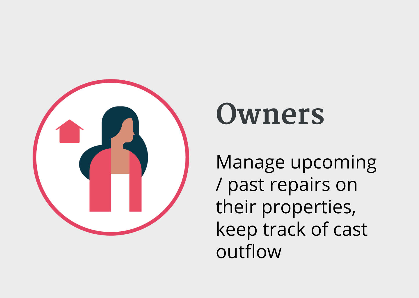
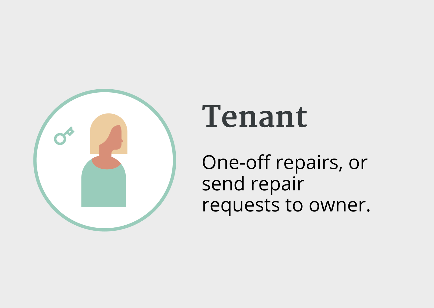
There are 3 main users in Jammer: tenants, owners and professionals. Tenants report damage, professionals carry out the repair, and owners can follow the process from start to finish - all in one place.
What did we have to do?
Our task was to bring clarity to the repair process for all three users.
This meant that we had to build three user flows, for the different parts that we wanted to satisfy.

Priorities & business goals
• Streamline process for all users
Communication, process transparency, quotes.
The current design had a lack of streamlining the process in the three different roles.
Push subscription model
KPI: Conversion rate: number of people who contact through the site (compared with beforehand)
Define Jammer’s users. Expand from just Malaga to whole Andalucia
What is out there? COMPETITORS
Two competitive platforms that stood out to us with strong designs were Jobin and Handy.
Where Jammer can stand apart is the ability to send payment to a third party (owner, property manager, or insurance).

How did the current website look and feel like to the users?
We tested the current site with 5 people and did the desirability test - we asked them to pick up 5 adjectives that best describe their experience with Jammer.
The three adjectives that were common between all of them were: confusing, friendly, not enough information.


How do owners, tenants and professionals feel about the repair process?
Tenants
Tenants are usually money conscious, it is no worth for them to pay the repair.
First thing they would do is contact their landlord.
Most often they would send pictures via phone.
Often the repairs are urgent and they want a fast solution.


Owners
Usually are busy, but they try to be reachable.
Prefer to have a professional that they have worked with before.
They have a list of professionals for everything they need, but sometimes they are not available and have to look for other people.
Want to follow the changes - the materials and outcomes.
The communication goes via phone.
Professionals
Usually work without an agency, through word of mouth.
They get approached is by phone calls.
Sometimes they need photos to see the problem better.
Want to use best quality materials and be recommended.

Defining the user flow
Based on the benchmarking and the stories from the interviews, we identified the user flow:


So, how might we provide a clear and quick process for all parties when a home repair is needed?
Based on the research, we found the following solutions for optimising the process:
Mobile first - all 3 parts use their phones when they communicate;
Provide more guidance for people who first enter Jammer, but also those who use it regularly;
Flexibility for all parts;
Professionals register separately

We designed 3 USER flows according to their role.


We conducted 6 usability tests during the process to identify how users respond.
❌ Problem 1: Confusion about card details
In the original repair request flow, the final step before submitting a request asked users to enter full card details (card owner, number, expiry, CVC) upfront — framed as a way to "secure" the professional's payment, even though the user wasn't actually being charged yet.
Usability testing surfaced 2 distinct issues at this step:
3 users were confused about why they needed to provide payment details at this stage, since they weren't paying yet
2 of those 3 said they felt threatened by the step, worried their card details would be taken before they'd even registered

✅ Solution
The step was redesigned to first ask "Who's paying?" with three options — I am, Owner or someone else, or My insurance — before ever asking for payment details. This reframes the step around responsibility/routing rather than immediate payment.
Payment details were also made explicitly optional at this stage, surfaced only as a collapsible "Add payment details now? (not required)" link, with a clear note that details can be added later when confirming the appointment with the professional.
This addressed the confusion (users now understand why this step exists — it's about who's responsible, not immediate charge) and reduced the feeling of being pressured, since card entry is no longer forced before registration.
❌ Problem 2: Four screens to do one task
When providing a quote for a repair job, professionals needed to break down pricing across price for work, price for materials, price for transport, and commission — since real-world quotes often include extra costs like transport fees or urgency surcharges.
The original flow spread this single task across 4 separate screens, each requiring the professional to click through (or skip) before reaching the next. This made a simple quoting task feel unnecessarily heavy and slow.

✅ Solution
The flow was consolidated down to a single screen, using a collapsible "Need help calculating?" section. By default, professionals see just a price estimate field and a deposit slider — fast for those who already know their number. Expanding "Need help calculating?" reveals the itemized breakdown (time/rate, materials with quantity and price per unit, ability to add more materials), so professionals who want to build up their quote step-by-step can still do so.
This kept the flow lightweight for confident users while still surfacing the detailed breakdown for those who needed it — reducing the task from four mandatory screens to one flexible screen.

Overview
This project spanned three distinct user types - tenants, owners, and professionals - each with their own dedicated user flow, delivered within a 10-day timeline. The scope was ambitious: over 100 screens designed across low-fidelity, mid-fidelity, and high-fidelity stages.
In hindsight, prioritization should have played a bigger role earlier in the process. While Jammer had a clear vision of who their core users were, several important details about each user group's needs and behaviors were still missing at the outset. Early research also led to a key strategic pivot: moving from a web-first to a mobile-first approach, since the core user journey consistently happens on the phone.
